UX Case Study — African Youth Commission
Designing a freight marketplace built for West Africa
How a cross-cultural team guided by real research with Sierra Leonean drivers, artisans and retailers built a two-sided logistics app from the ground up — and what it takes to design trust into every interaction when your users are connecting livelihoods, not just packages.
- 8
- months and ongoing
- 17
- key flows across two modes
- 13
- research participants
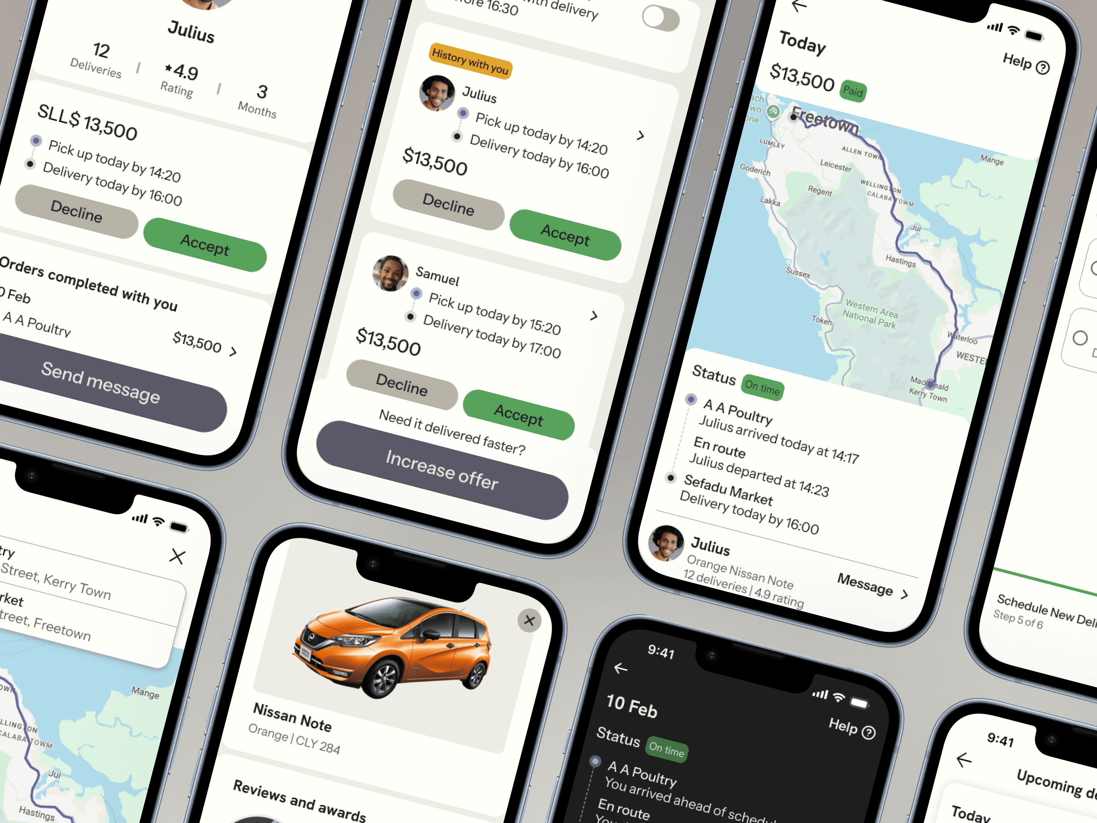
The Brief
The United Nations and the African Youth Commission asked me to lead the design of a two-sided logistics marketplace for Sierra Leone — a platform where businesses sending goods could connect directly with independent drivers to negotiate, accept, and complete deliveries.
Think of it as the freight equivalent of ride-hailing, but tuned for the economic realities of West African commerce: variable pricing, trust built through reputation, and a currency (the Leone, SLL$) requiring its own formatting and cultural framing.
The scope spanned both sides of the marketplace — a driver mode and a sender mode — with an initial market in Freetown, Sierra Leone and a 5–10 year continental expansion roadmap informing every foundational decision. Eight months in, the product is still in active development.
My Role
Lead UX Designer. Responsible for end-to-end design direction across both modes, primary research, key flow decisions, developer partnership, and day-to-day leadership of four junior designers handling execution, component-level design, and visual QA.
One product, two distinct user roles
Driver Mode
- Available jobs and active deliveries
- Profile, settings, ratings + reviews
- Earnings summary and payout options
- Navigation and route optimization
Sender Mode
- Jobs currently open and deliveries in progress
- Profile, settings, and feedback
- Overview of expenses and payment methods
- Link to WhatsApp-placed orders + business dashboard
One of the earliest and most consequential design decisions was giving the driver and sender experiences not just different content, but visually distinct identities — expressed through opposing UI themes that make the user's context unmistakable at a glance.
Decision: purpose-built themes per user roleDesign System Note
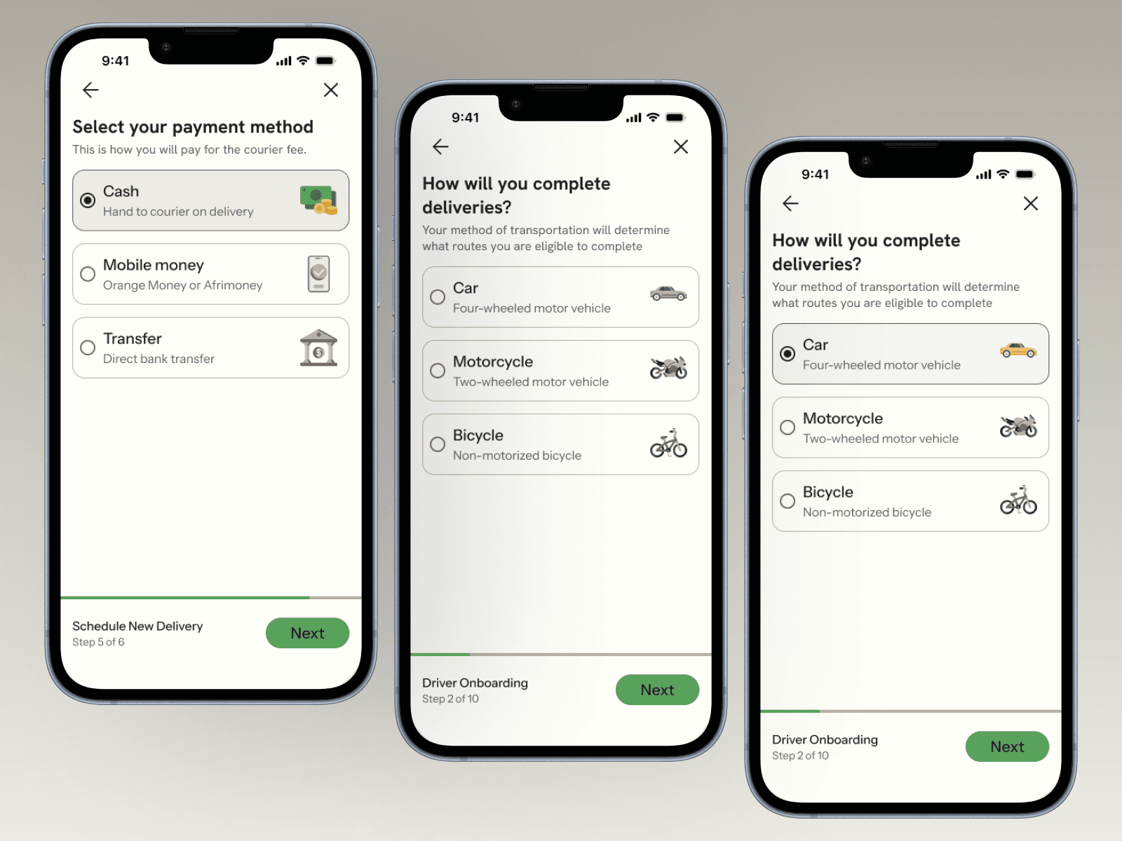
Maintaining two coherent themes with a team of junior designers required a shared component library from day one. Both themes draw from the same typographic scale, spacing system, and components — only color tokens and patterns differ. This also makes the 5–10 year expansion roadmap ready to scale.

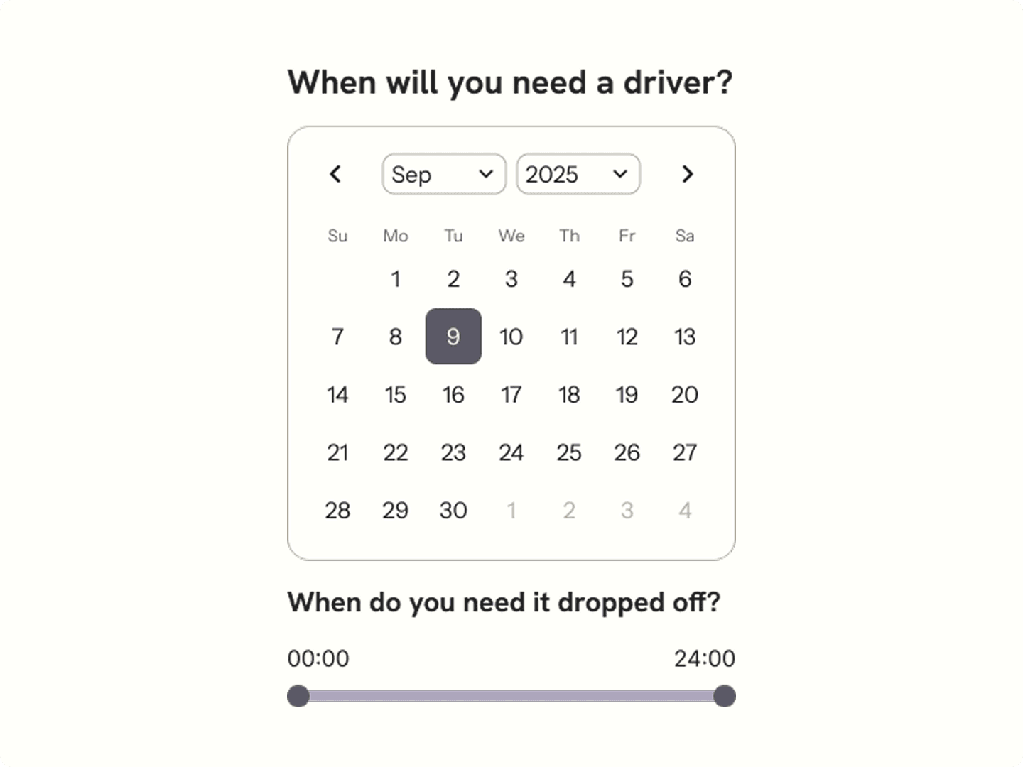
How eight months unfolded
Informational Interviews
Across drivers, artisans and retailers
Establishing the business logic, bidding system, trust signals. Confirmed that the context was different enough between roles to warrant separate UI themes.
Key Flows
Translating interviews into requirements
Defining the two-sided marketplace structure, vehicle categories, payment flow, negotiation model, and the two-theme design system. Aligning with dev on V1 scope. Identifying the 17 key flows.
Junior Designers
End to end design
Leading juniors on design system use, build flows balancing freedom to creatively problem solve and meet requirements. Weekly crits, bi-weekly dev syncs, cultural review gate before anything went to testing.
Moderated Usability Tests
Stress testing
Same artisan and driver participants from the informational interview selected for moderated usability testing on the most critical flows: scheduling a delivery, building a profile, safety, and communication.
Research takeaways
Artisans
Artisans were highly price-sensitive and mistrustful of fixed pricing. Every participant had experience negotiating transport costs. A take-it-or-leave-it model would have felt alien and extractive.
Drivers
Described being burned by informal jobs where payment was delayed or disputed. "I need to see it is paid before I move." Payment certainty, not speed, was the primary anxiety.
Retailers
Retailers running recurring routes had strong preferences for known drivers. "If I've worked with someone before, I want to go back to them." Relationship continuity was a core expectation.
Across All Groups
Nobody used a freight app currently. The mental model was entirely WhatsApp messages, phone calls and word-of-mouth. We couldn't borrow UX conventions — we had to earn each pattern from first principles.
Research to design
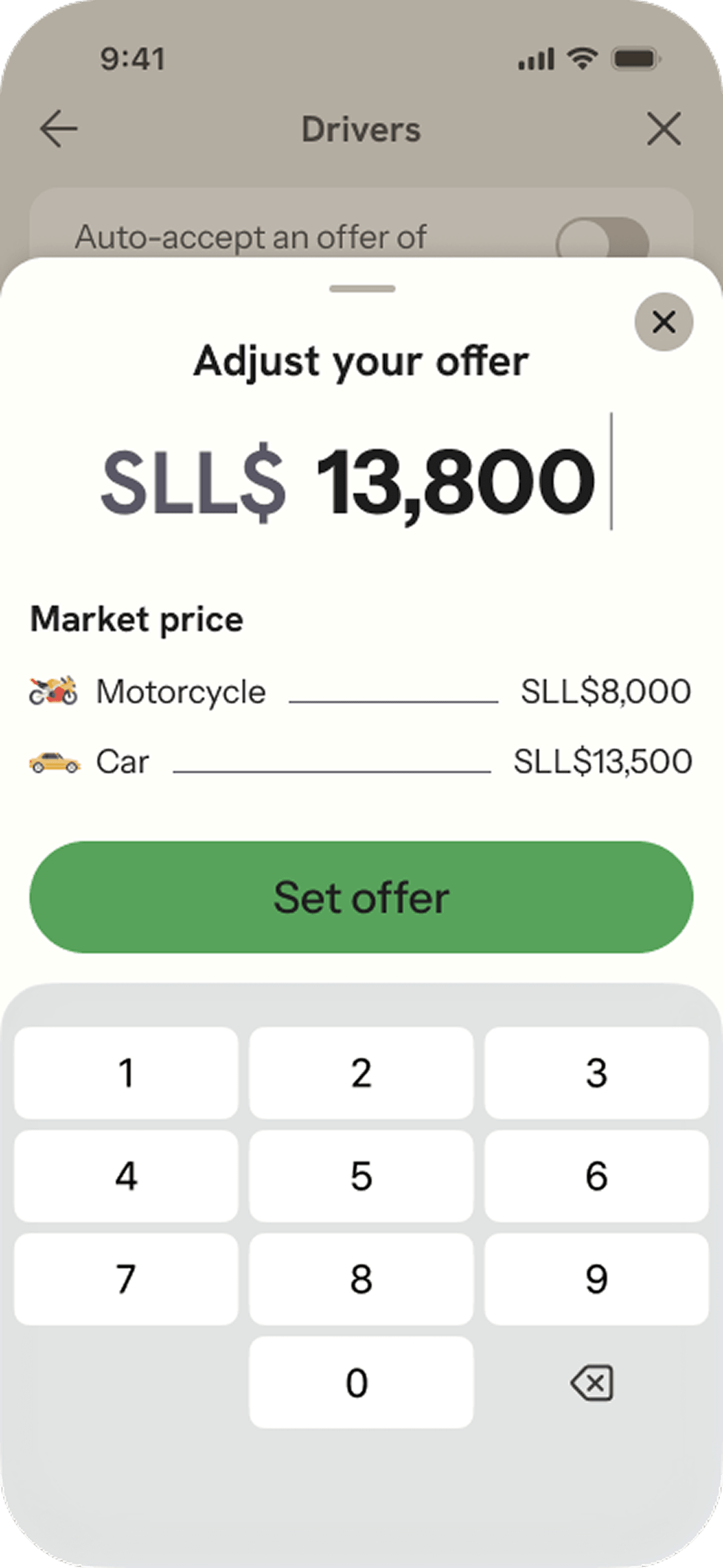
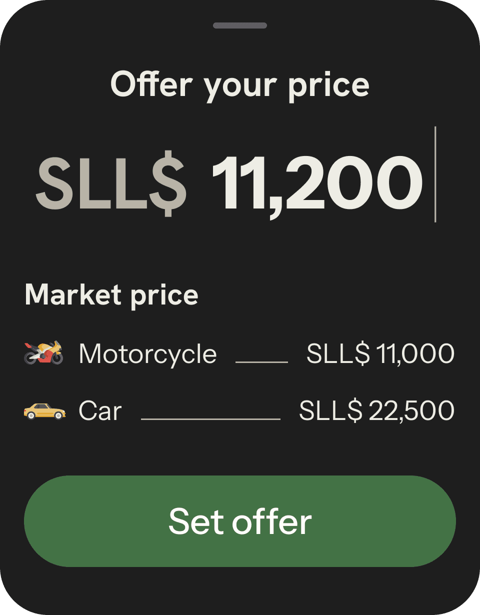
Artisans expressed that the current solution of word-of-mouth arrangements relied heavily on negotiation. Cost was a major factor in their business decisions. Fixed pricing was viewed with skepticism. This informed:
- Displaying market price based on vehicle, route distance, timing and specialty needs (refrigeration, fragile handling)
- Allowing drivers and artisans to send counter offers
Leading the team
Research briefings before building assignments
Before any designer touched a frame, I walked through interview findings. I mentored designers in how to anchor design decisions to real research.
Ownership as a teaching tool
I assigned junior designers to own ~3 flows each. I took the remaining four and the majority of the design system — which are displayed in this case study. This forced them to think about the entire flow end-to-end and collaborate for consistency across the app.
Critique grounded in user empathy
I guided the junior designers in tying critiques back to user research and asking “what does the user think at this point?” rather than purely looking at appearance. That shift pushed feedback toward behavior rather than aesthetics.
My job was to hold the design vision steady while giving junior designers real ownership, not just execution tasks.
Flows I owned
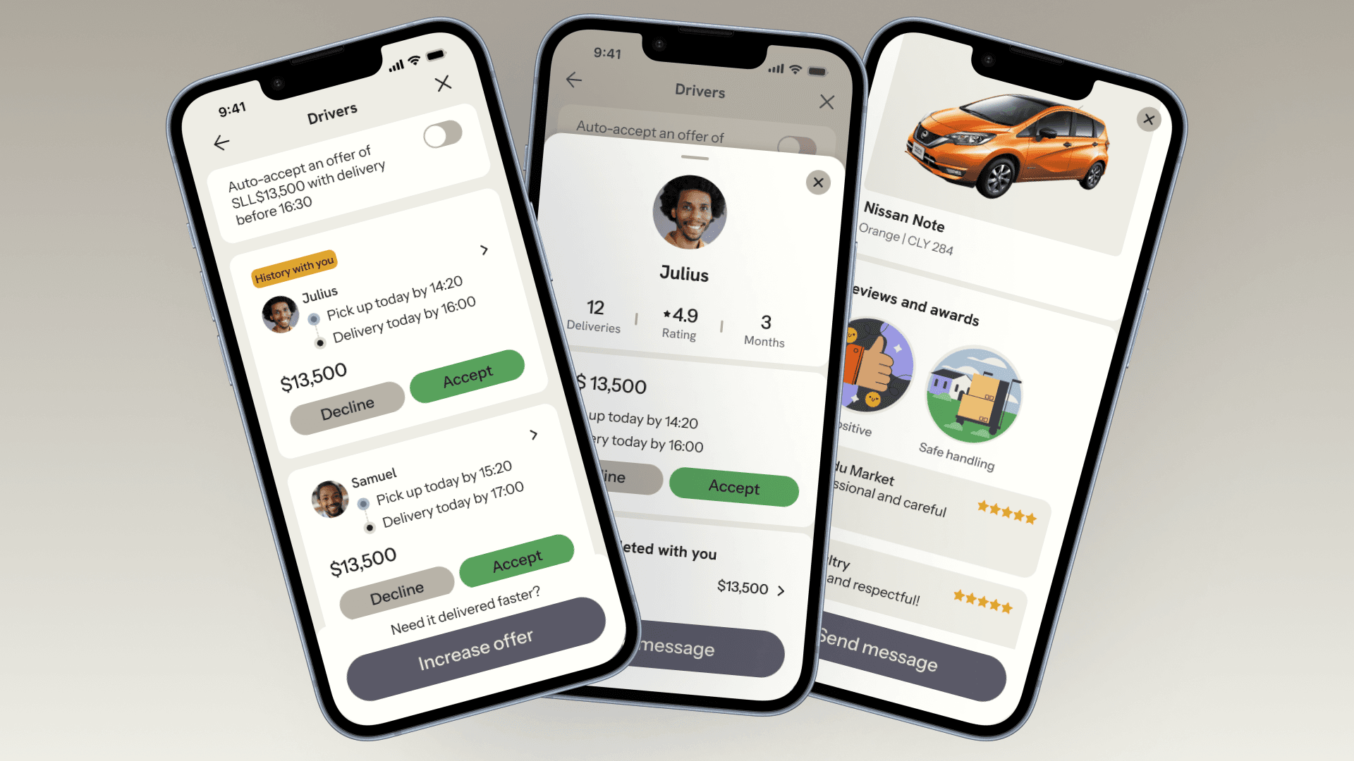
Driver Offers & Profiles
Farmers can view, compare, and accept driver offers — with full driver history and reviews surfaced at the right moment.
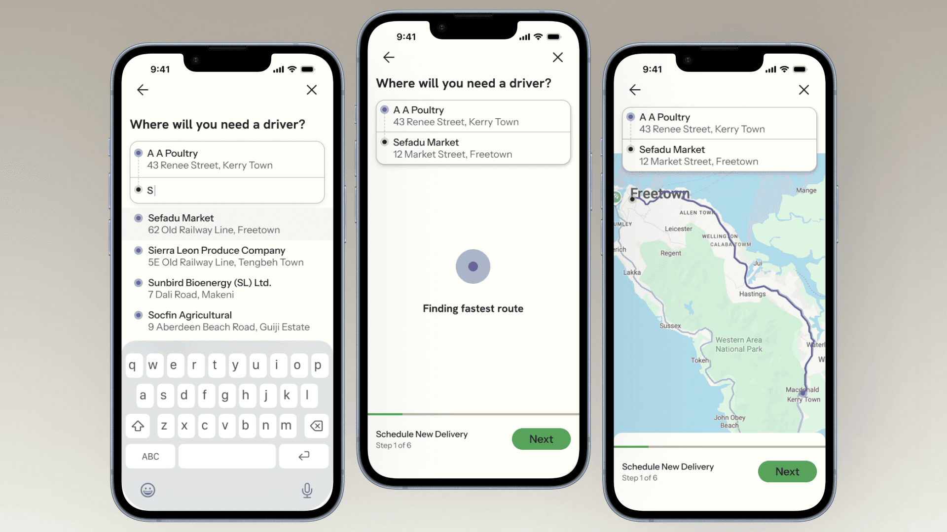
Route Selection & Preview
Address search with autocomplete and live route preview before committing to a delivery.
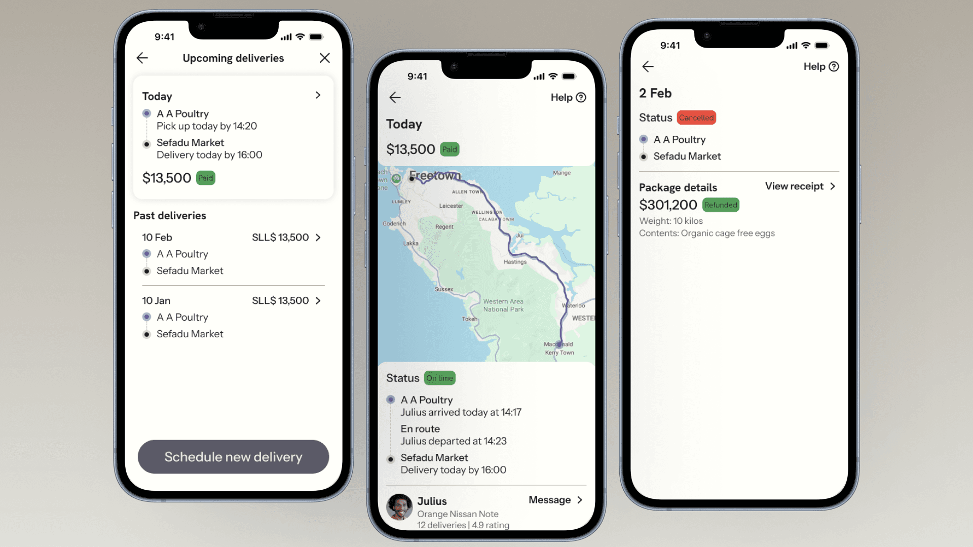
Upcoming Deliveries
A clear at-a-glance view of today's delivery, live status updates, and driver contact — all in one screen.
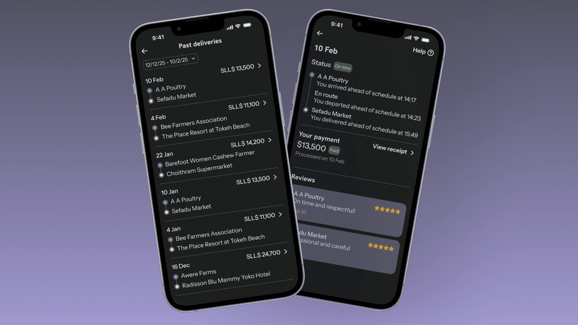
Driver's Past Deliveries — dark mode
A full delivery history with payment status, timeline, and reviews — in dark mode for the driver-side experience.
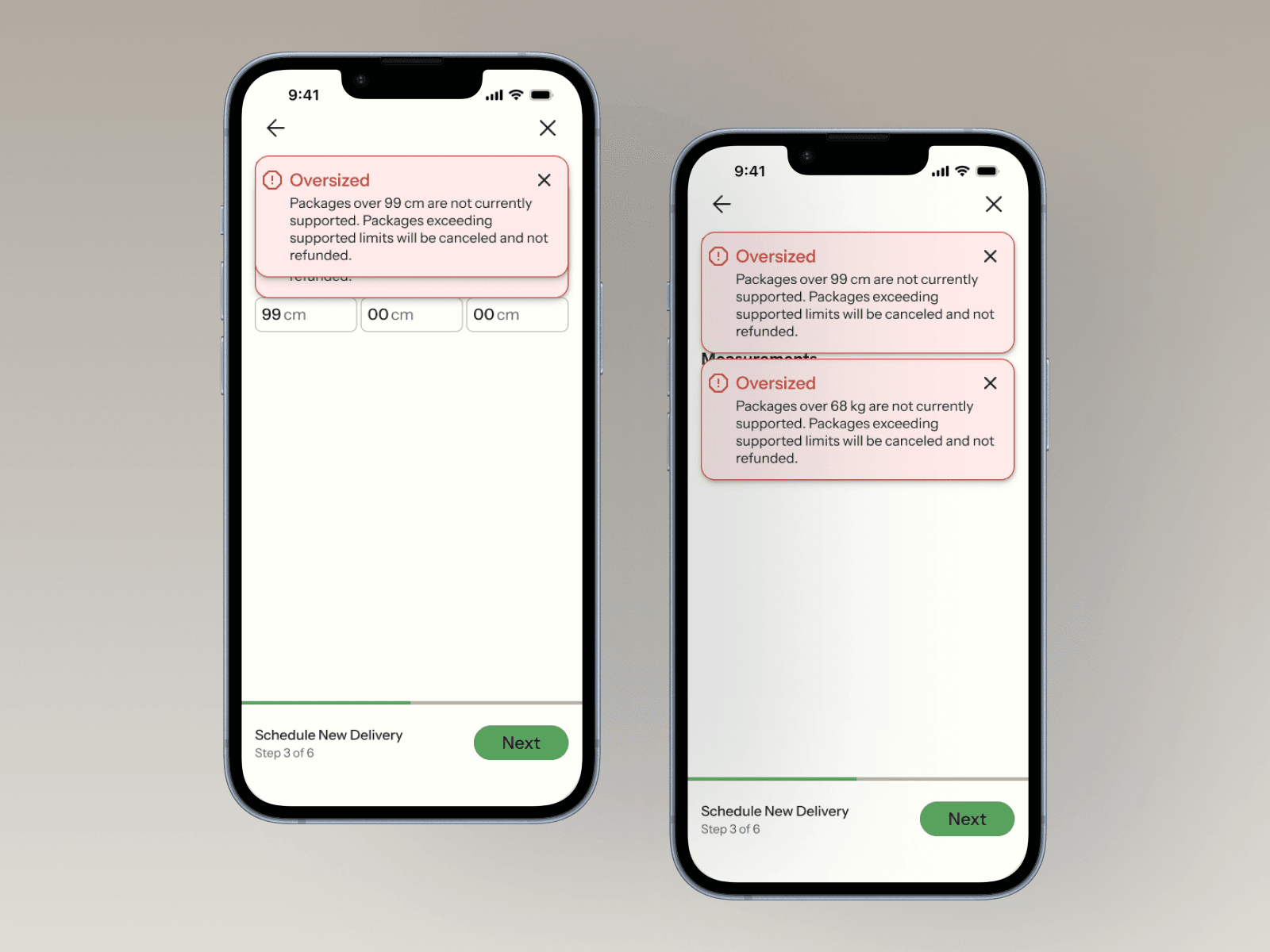
Design System Components
What research validated vs. changed
Validated
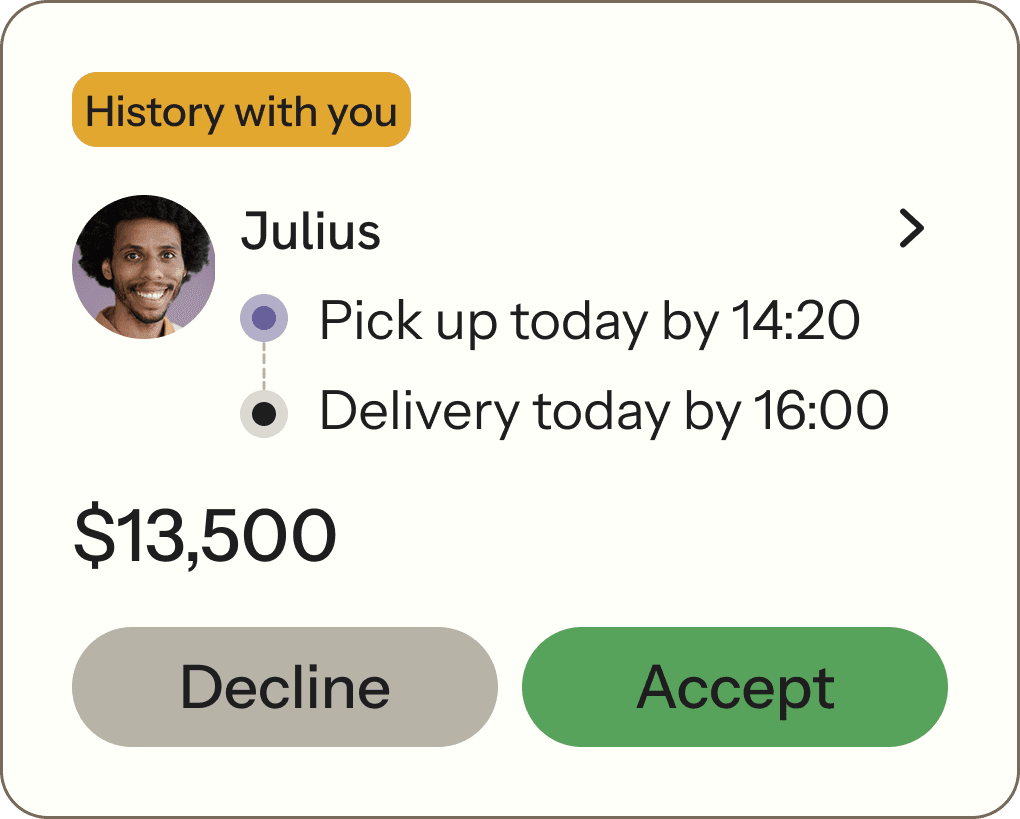
The negotiation flow required zero prompting across all driver and artisan participants. The “History with you” badge was noticed and mentioned positively by every returning participant.
Changed
The counter-offer keyboard tested poorly — early participants expected to type a fresh price, not edit an existing number. We revised the input to clear on first tap. “Scheduled deliveries” was revised to “Upcoming deliveries” and included past deliveries below.
What I would do differently
More Artisan Participants
Only 3 interviews — that group was underrepresented relative to how distinct their needs proved to be.
Offline-First Architecture
Connectivity across Sierra Leone is variable. This conversation with dev happened a few weeks in. It should have been week one.
Handoff Mentorship
Handoff SOP for the junior designers from the start. Annotation quality varied across the team. A checklist should have been in place from day one.
The real win
We built a product that treats informal economy drivers as sophisticated economic actors rather than passive recipients of assignments.
Qualitatively
Participants who returned for usability testing came in with expectations shaped by discovery interviews. When those expectations were met — “I can see who paid me,” “I can go back to the same driver” — it landed not as a pleasant surprise but as a baseline that had been kept.