Product designer — audit, redesign, and design system patterns
Scope
UX audit, responsive redesign, output clarity
Company
New York Life
Team
Madison Avenue Design Team
User
Consumer-facing
Improved comprehension and responsiveness across 3 calculator products
New York Life provides financial products that support long-term planning decisions — such as savings, retirement, and risk management. Interactive calculators help users explore scenarios and understand potential outcomes. For many users, these calculators represented their first meaningful interaction with complex financial tradeoffs — often before speaking with an advisor.
Use Cases
Estimate long-term financial outcomes
Compare scenarios and assumptions
Prepare for conversations with advisors
Explore “what-if” decisions independently
the key issue
The calculators were mathematically correct, but difficult to interpret.
—Understanding which inputs mattered most
—Interpreting outputs without additional context
—Connecting results to real-world decisions
“I identified the core tension — accuracy vs. comprehension.
Financial tools must be precise, but precision alone does not create understanding. The challenge was to preserve accuracy while making results easier to interpret, contextualize, and act on.”
The decisions
The problem — sliders alone excluded users
01
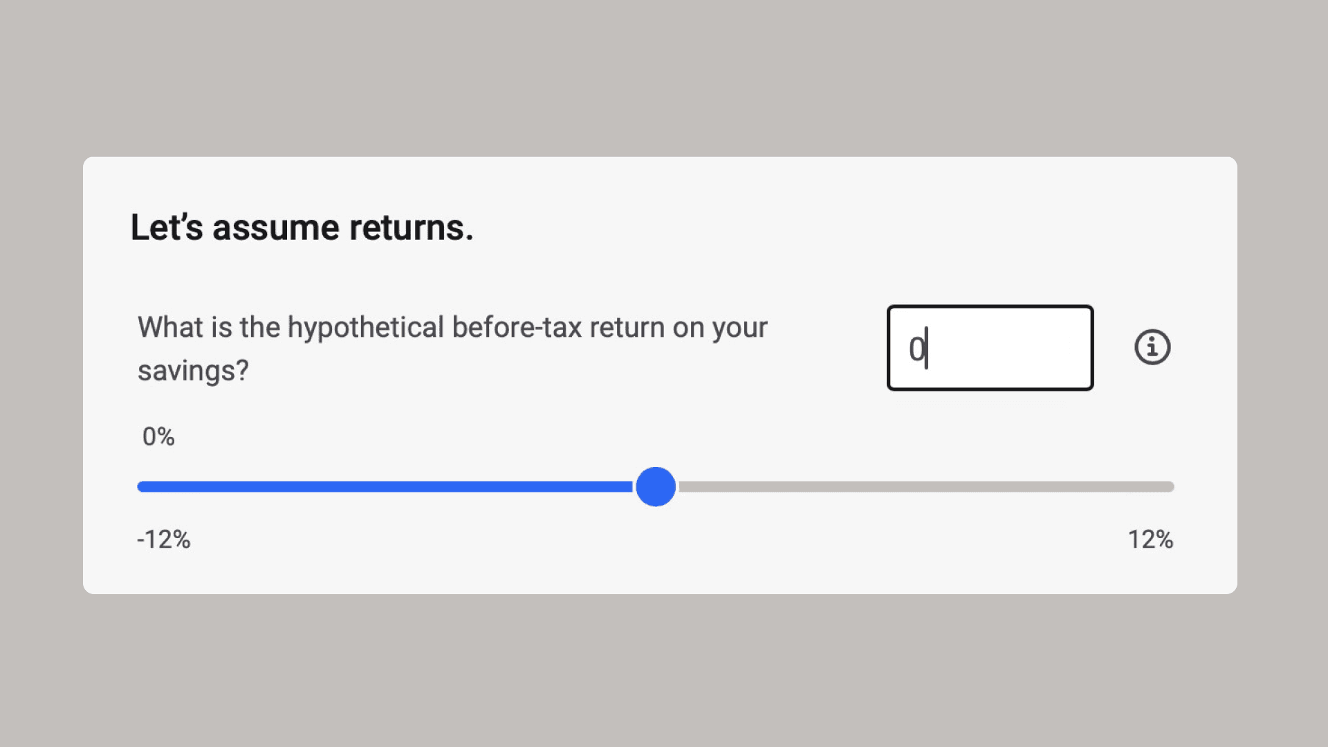
Paired numerical input with every slider
Sliders are inaccessible for keyboard-only users and imprecise for anyone entering a specific value. Adding a synced numerical text input alongside each slider solved both problems simultaneously — users could drag or type, and either input updated the other in real time. This was an accessibility requirement that also reduced input errors.
Met WCAG keyboard accessibility requirements while reducing input friction for all users
The problem — users didn't know how much was left
02
Added a step progress bar to surface the full scope upfront
The original calculator had no indication of how many steps remained, causing users to abandon mid-flow. A simple progress bar ("Step 1 of 5") set expectations immediately and gave users a reason to continue. This also enabled progressive disclosure — complex inputs could be introduced later without overwhelming the first screen.
Reduced mid-flow abandonment by surfacing scope and progress at every step
The problem — results were precise but not understandable
03
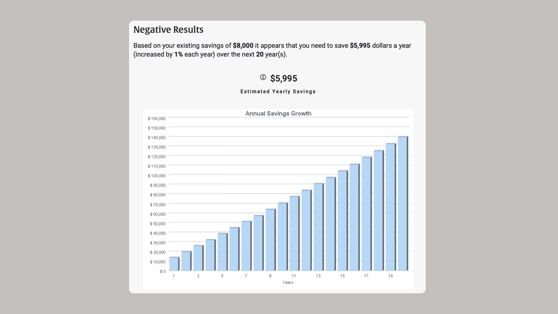
Led results with plain-language summary before the chart
The original results page showed a chart immediately, requiring users to interpret data before they understood their outcome. The redesign led with a single highlighted number and a plain-language sentence explaining what it meant — then showed the chart for users who wanted to explore further. Understanding before precision.
Users could act on results without needing to interpret the visualization first
The problem — the conversion point was interrupting the flow
04
Anchored the advisor CTA to the results page only
The call to action to connect with a New York Life financial professional was appearing too early, before users had seen their results. Moving the CTA to the bottom of the results page — after the user had already received value — made the ask feel earned rather than pushy. The results page ends with a clear next step without forcing it.
CTA appeared at peak motivation — after the user understood their gap — not before
What actually shipped?
—Clear results page with a CTA button situated at the bottom
—Added numerical input for enhanced accessibility on sliders
—Output designs that emphasized understanding over precision
—Step progress bar reduced cognitive load across multi-step flows
Outcomes
—Improved user comprehension of financial scenarios
—Reduced confusion around inputs and results
—Massive improvement in responsiveness and accessibility
reflection
Usability on a functional level can be just as important in garnering trust as the actual content of a tool.